In my last blog post, I shared about my experience of rediscovering my personal color swatches from the 1980s. It made me curious about how the color language I learned at that early age has translated into my work as an interior designer. So we thought it would be fun to collect a series of project photos to compare dramatic use of color to a more understated approach.
In the primary bedroom of our St. Francis Woods Residence project, the deep turquoise color of the accent chair and ottoman adds a richness to the room while maintaining the overall tranquil and serene vibe. Meanwhile, in the living room of our Berkeley Hills Residence project, the entire room – from baseboards to crown molding – was painted a similar hue. In this space, the color acts as neutral in that it complements all the other layers of pattern, color, and the client’s collections.
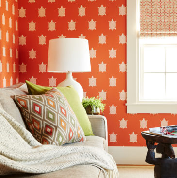
While the terms “understated” and “orange” might not seem a likely pair, the living room of our Noe Valley Residence project proves this combination possible. The subdued but still saturated rust-colored rug grounds the otherwise neutral room – allowing the creams, taupes, and natural finishes to pop against it. At the other end of the orange spectrum is the guest room / office space of our Berkeley Hills Residence project. A bright turtle-printed orange wallpaper sets the vibrant tone, which is only reinforced with splashes of orange in the roman shades and accent pillows.
White kitchens are popular for a reason. The classic look has a timeless appeal, but this room should not be overlooked as a space to add a dose of color. For our Castro Residence kitchen remodel project, a beautiful emerald green backsplash paired with white cabinetry keeps the room feeling quiet and calm while also fresh and unique. For a more dramatic vibe in our Berkeley Hills Residence project, we paired a rich mustard yellow backsplash with an equally bold blue for the cabinetry – a full embrace of bright and bold color.
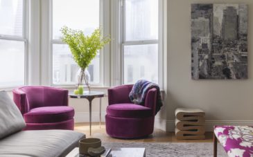
Lastly, our North Beach Residence project is a great example of a home that balances restrained doses of color with rooms of full saturation. While the upper level living area was kept airy and bright with light-colored walls, punches of fuchsia add personality. Meanwhile on the lower level, enveloping blues and reds create a cozy and layered space.


share it
email it