Nystrom Design recently completed the interior design of a full house in the Berkeley Hills of California. From our very first meeting with the client, it was clear that the entire family embraces strong color, and that this would be an important design element.
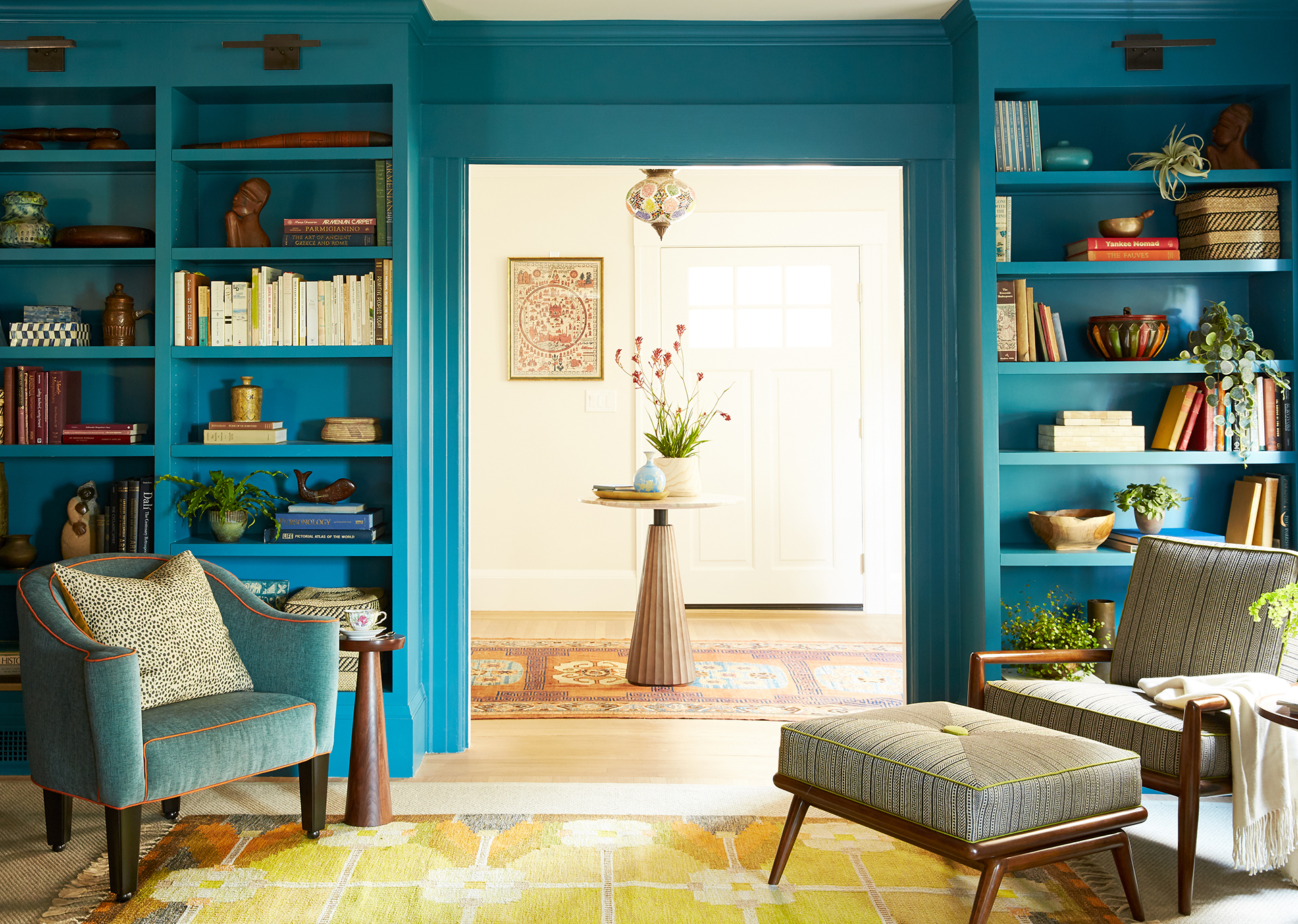
We began the project by making several key decisions for the ground floor level. These included custom-built shelves in peacock blue, a persimmon-colored starburst-patterned wallpaper on the dining room ceiling, and mustard yellow tile for the kitchen backsplash.
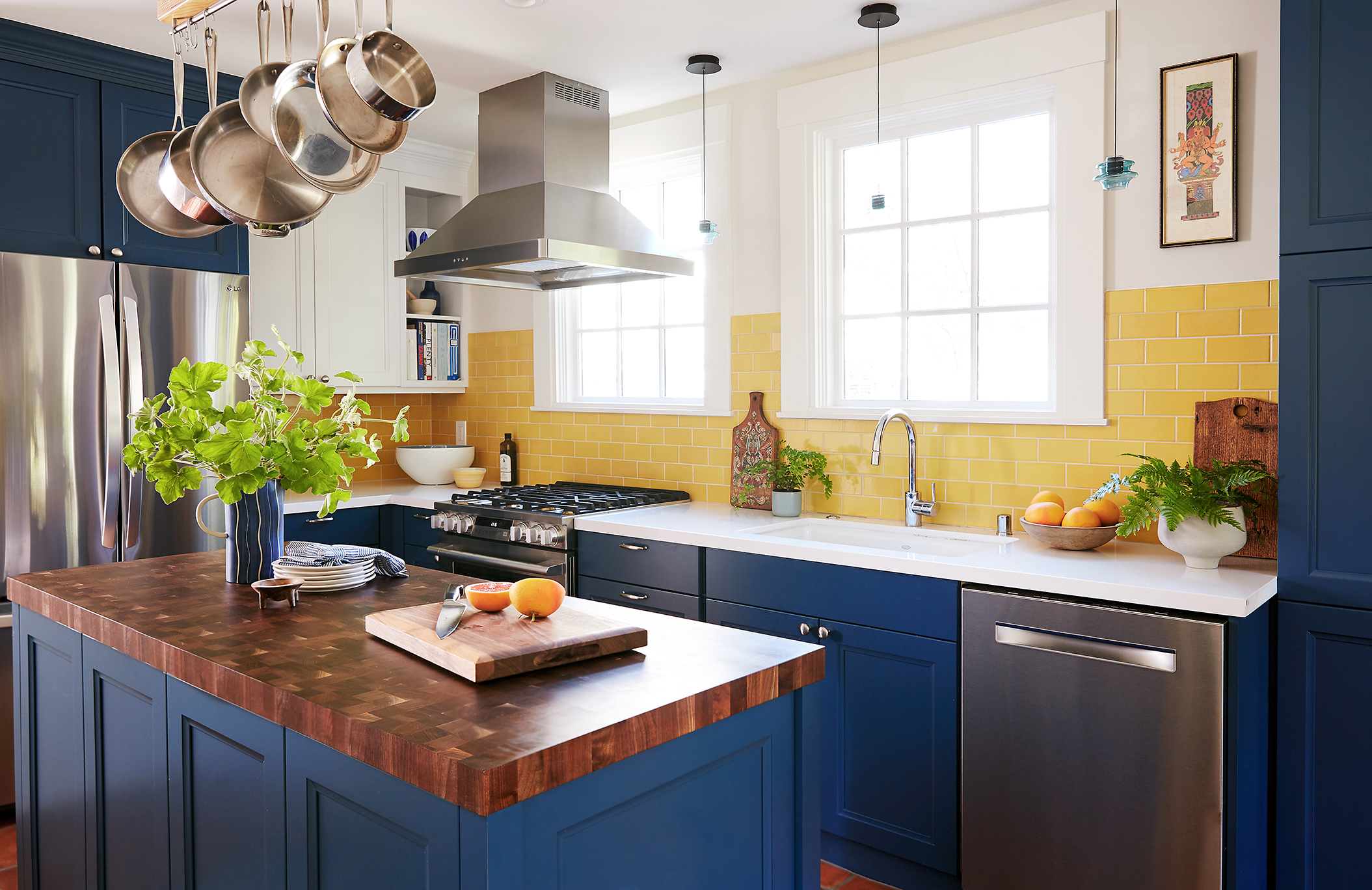
The parents were the primary decision-makers for the lower level, but when it came time to develop the upper level of the home, we wanted to be responsive to all five members of the household.
The Design Criteria:
- Each of the three teenagers wanted to be involved in creating a distinctive identity for their bedrooms.
- The two girls would be sharing a room.
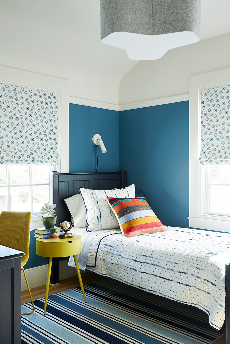
- The son wanted a blue room.
- The four bedrooms and two bathrooms on the upper level needed to relate to the lower level.
- There are sightlines into all of the bedrooms from the landing at the top of the staircase. We wanted visual harmony between the rooms from this vantage point.
There were many factors to consider, so we started with a few early decisions that became anchors for developing the design.
The Parameters:
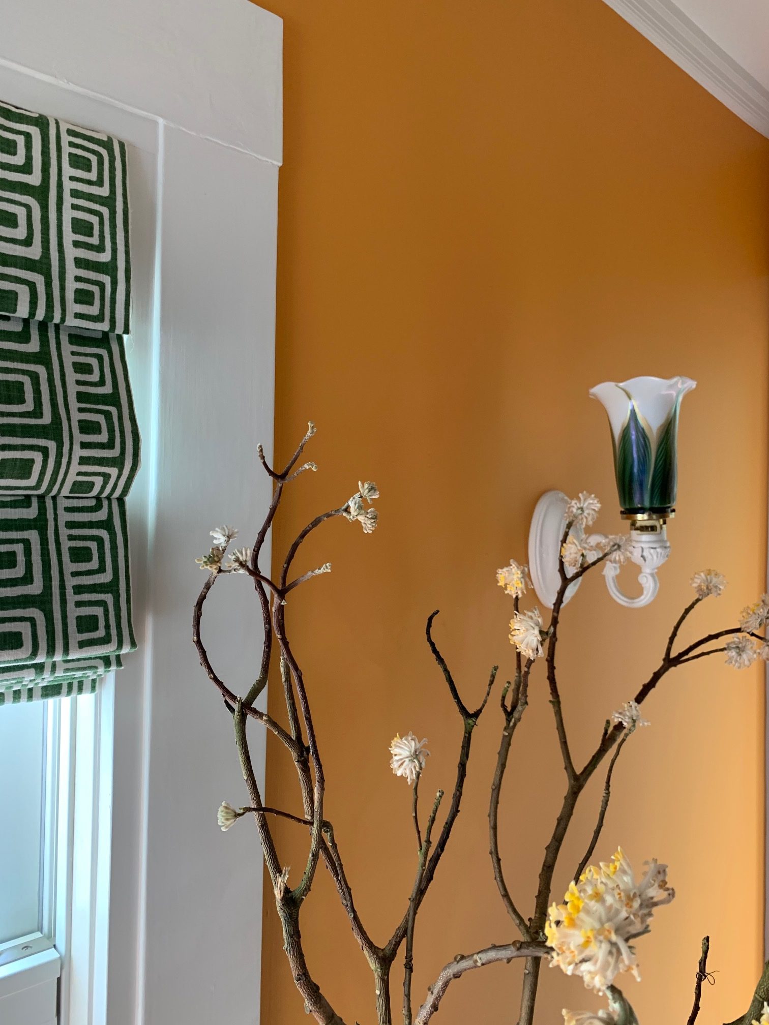
- A set of quirky green sconces that our clients wanted to re-use in some way.
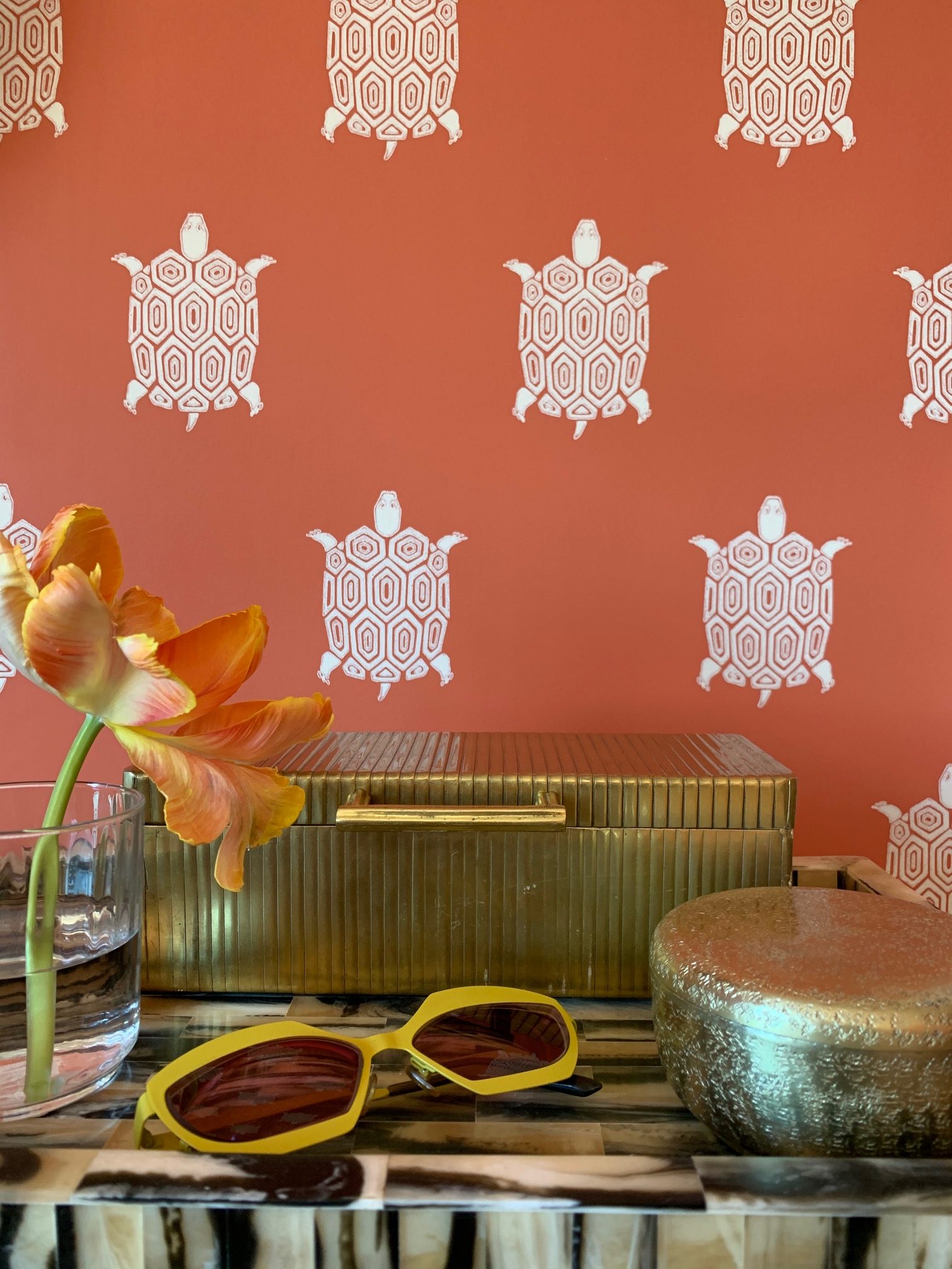
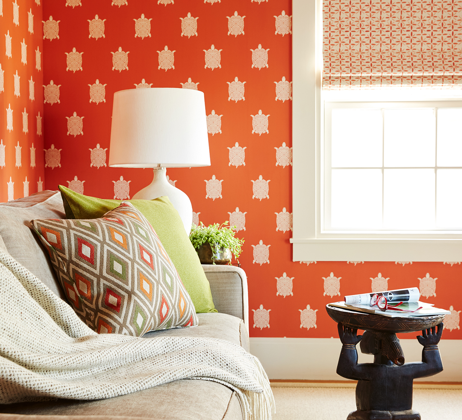
- The husband and wife were quick to select a turtle-patterned orange wallpaper for the office that doubles as a guest room. They were married in front of mating turtles at the Monterey Bay Aquarium Open Sea Exhibit. No further explanation required!
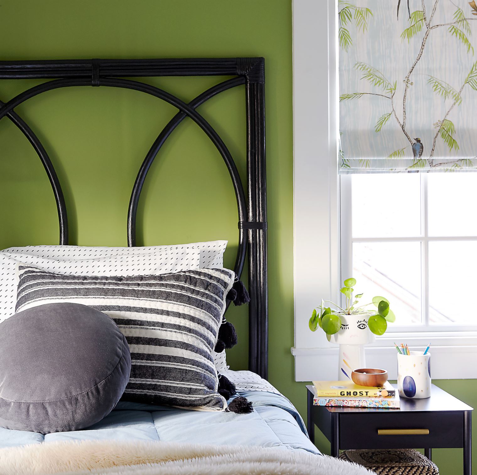
- When the two daughters who would be sharing a room found a fabric that they both like for their roman shades, we ran with it!
How the Design Evolved
Once this first set of decisions were made, we started to think about the four bedrooms as a collection. We focused on developing the primary elements for each room so that they complement each other, but each has a unique feeling.
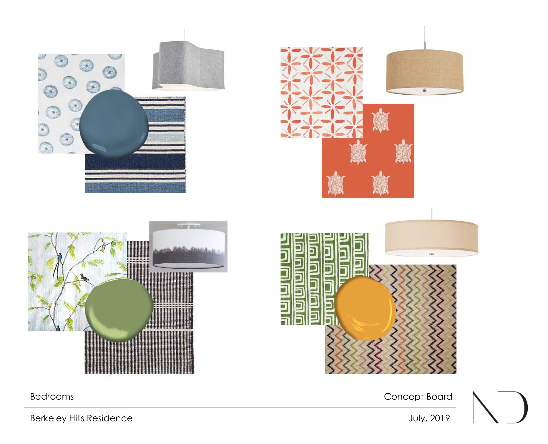
We presented concept boards depicting the wall color, fabric for roman shades, area rug, and light fixture for each room. It took a few rounds to build a concept that everyone approved of, but once these fundamental decisions were made, the rest of the furniture selections came together quickly.
Color and Relief from Color
Since the turtle wallpaper for the office was selected early, it set the tone for the rest of the color selections. When working with strong colors, it’s easy to end up with a palette that looks a little cartoony. This happens when colors are too close to the primary colors, or too bright. We wanted each room to have a similar level of saturation, but we selected colors that are slightly muted with undertones that lend harmony to the overall palette.
Pattern and Scale
Since the wall color in each room is so deep, we looked for some visual relief in the fabric patterns for the roman shades. Most of them have an off-white or pale background color. This was especially important in the office, where the turtle wallpaper has such a strong graphic effect. We did not want the fabric pattern to compete, and we limited the palette of the rest of the room to neutrals.
Furniture and Accessories
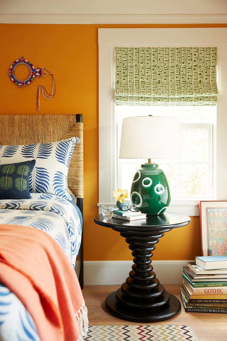
Because the color palette for each room is so strong, we focused on natural textures and neutral colors for the furniture. We looked for furniture with strong silhouettes, like the nightstand in the master bedroom.
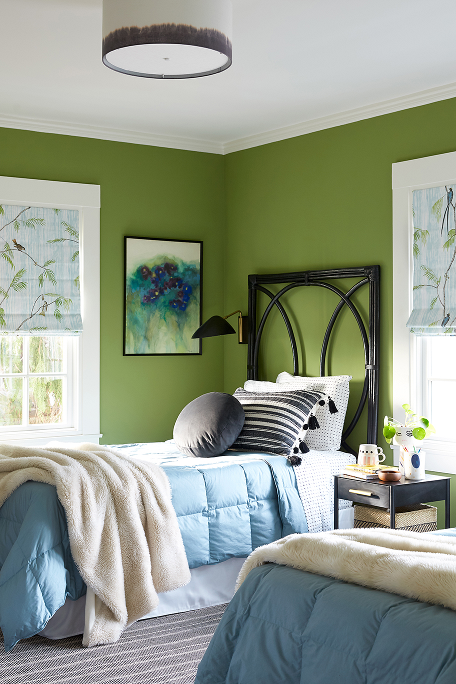
We also used black elements in the bedroom shared by the two girls. The black and white textural rug relates to the Shibori-dyed shade of the ceiling light fixture. Here the dye is black instead of the traditional indigo blue. We especially love the strong silhouette of the headboards against the pine-green walls.
If you would like to see the full set of photos from this colorful and eclectic project, head over to the Berkeley Hills Project in our Portfolio.
share it
email it