The completion of every project feels like a milestone worthy of celebration. Whether it’s the addition of a tiny powder room or furnishing an entire new home, it represents a meaningful transition into a new chapter of how you live in your home.
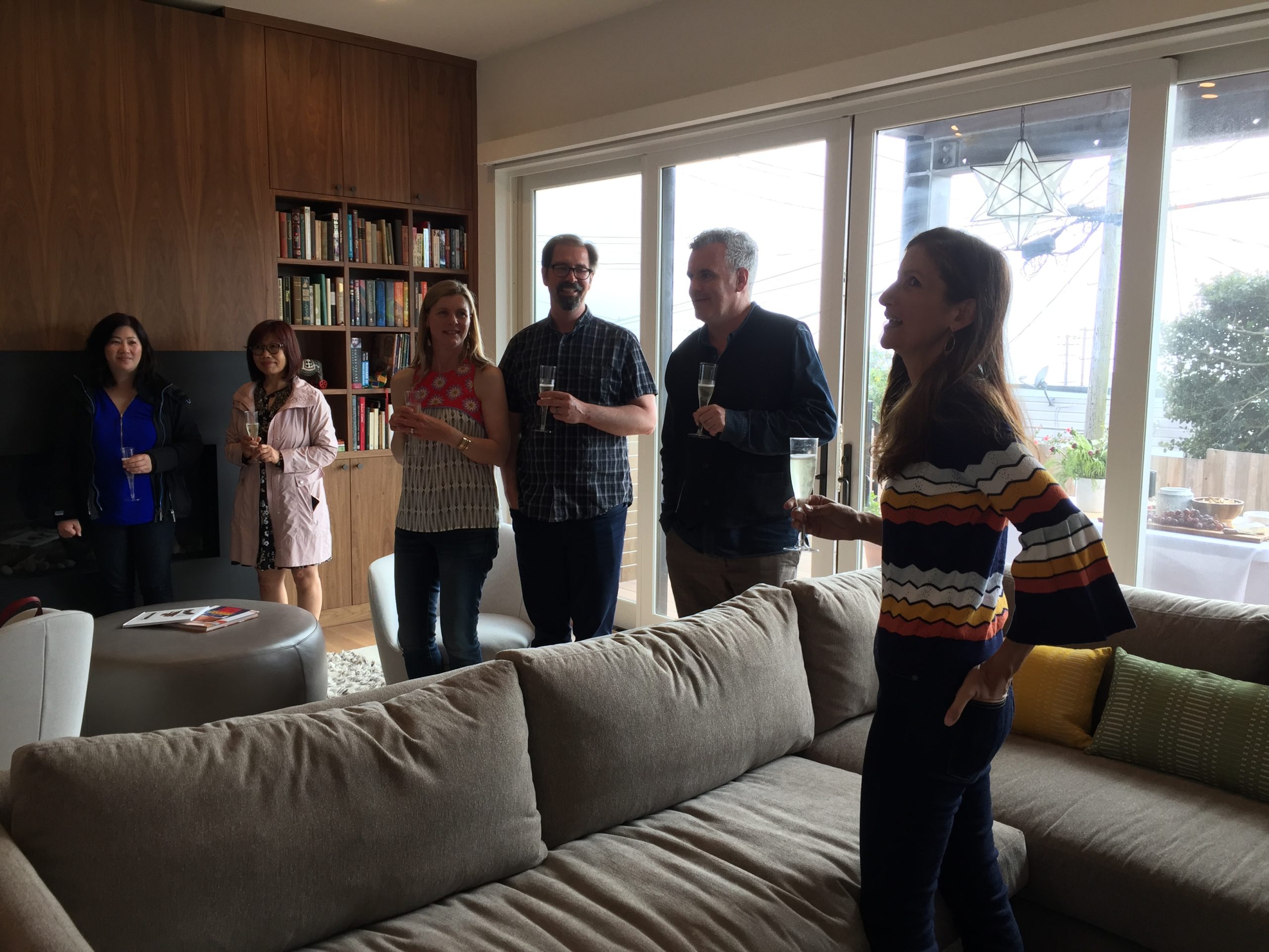
With a full-home renovation project we recently completed in the Parkside neighborhood of San Francisco, it was clear that an official celebration was in order. Over the course of this multi-year project, just about every challenge imaginable had been presented and handled by a team of dedicated, builders, vendors, and tradespeople. It was our pleasure to bring together the clients, their friends, and the project team to celebrate everyone’s contributions over a champagne toast.

When Nystrom Design joined this full-house remodel project, construction was about 50% complete. But some tricky design questions needed attention before things could progress.
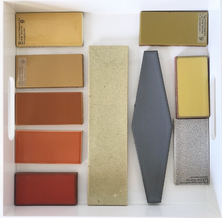
Selecting the tiles was just one of those decisions, but one that was very important to the clients. Prior to starting their remodel project, the family had lived in the house for over 10 years, and color had always been a strong element. The wife has a great eye for color, and they wanted the impactful use of color to remain a major design element. The key was to develop a palette that felt unexpected and sophisticated, but still fun.
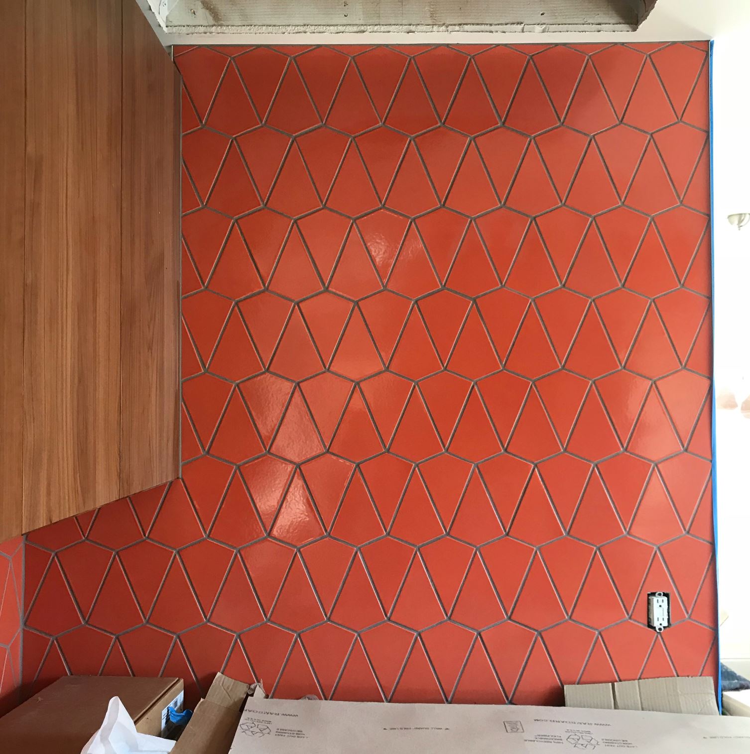
We got to work thinking about the color palette in a holistic way. We talked about site lines and the ways that certain colors would interact with others based on the application. An important part of the color conversation is always about creating relief from color. Color is most impactful when there is also a place for the eye to rest.
After much consideration, this Fireclay kite-shaped tile in tangerine was selected for the kitchen backsplash. The wall behind the stove is tiled from countertop to ceiling, and visible from the entire upstairs hallway, so we knew this decision would influence all of the color decisions.
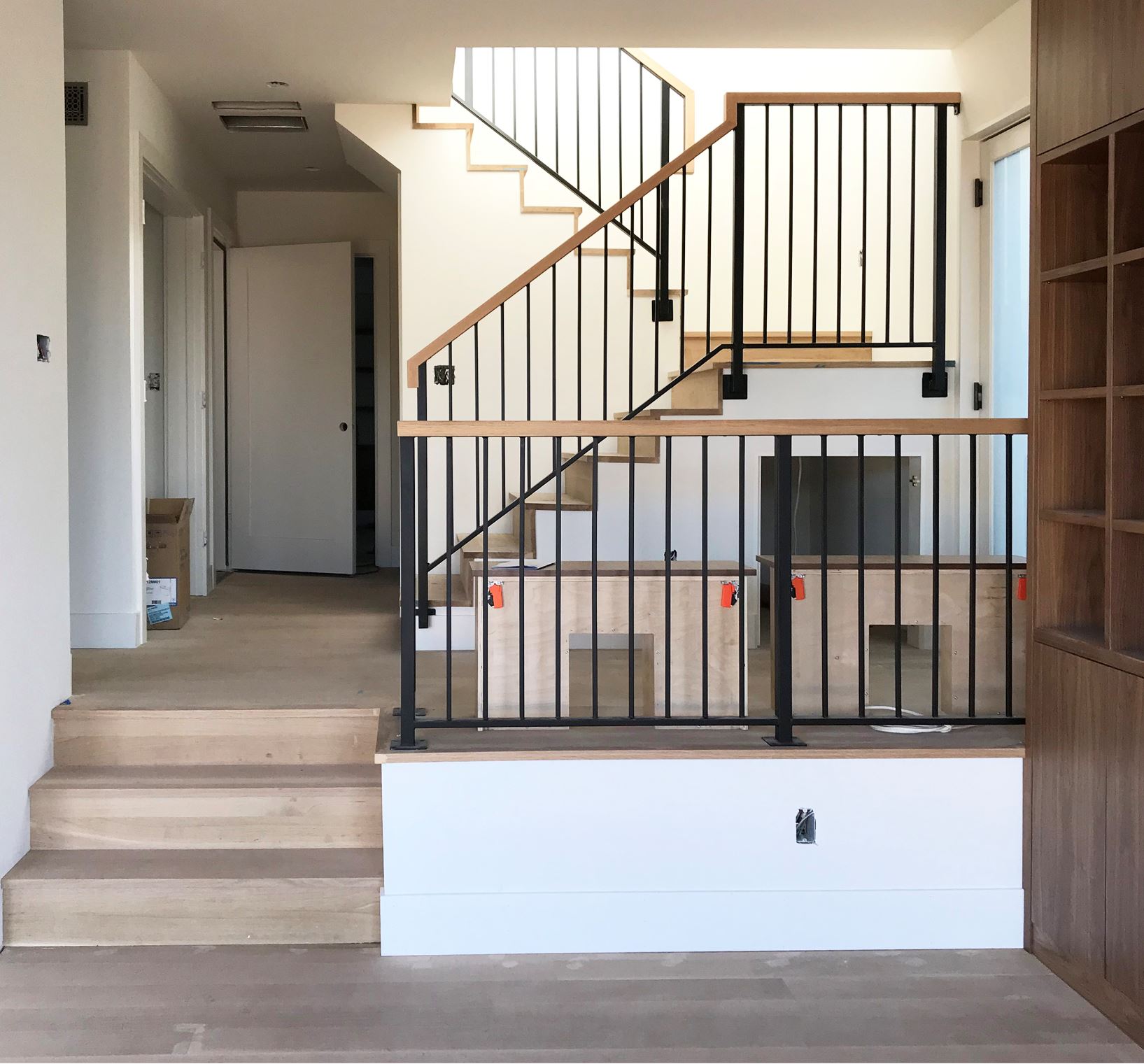
Similar to many San Francisco homes, this one is not large by modern-day standards. Killian O’Sullivan of O’Sullivan Architecture did a masterful job of maximizing the functionality of the home. He created the illusion of more space with the light-filled staircase he designed to connect the main level with the newly-finished lower level.
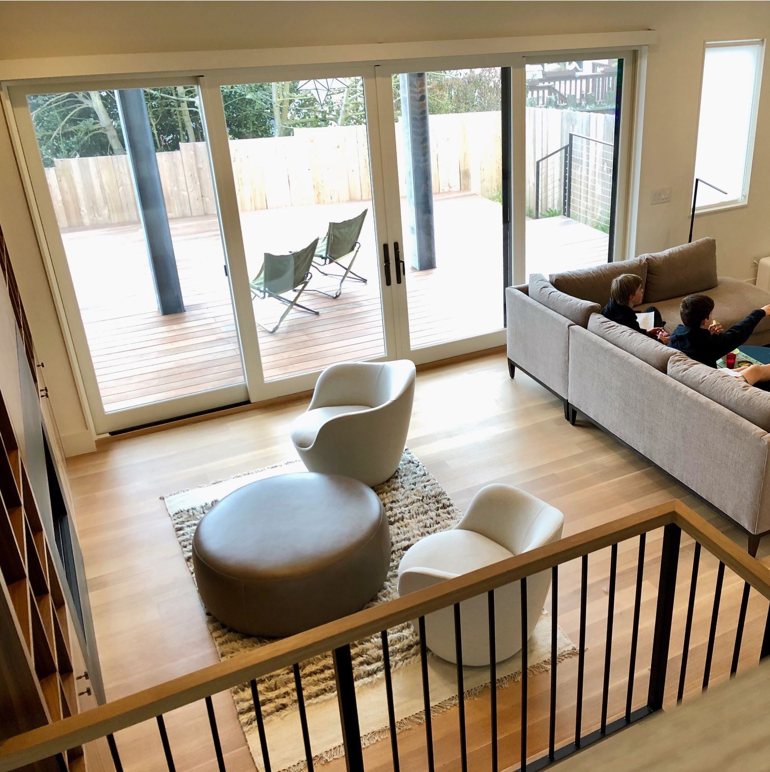
When Nystrom Design came on-board, the clients were very excited about the new family room that they would be gaining and had an abundance of ideas about how it would be used. With 10’ tall ceilings and expansive glass window walls that open up to a large deck, it was easy to get ambitious about the functions for this space. But those decisions were holding up framing and needed to be finalized to keep things moving forward.
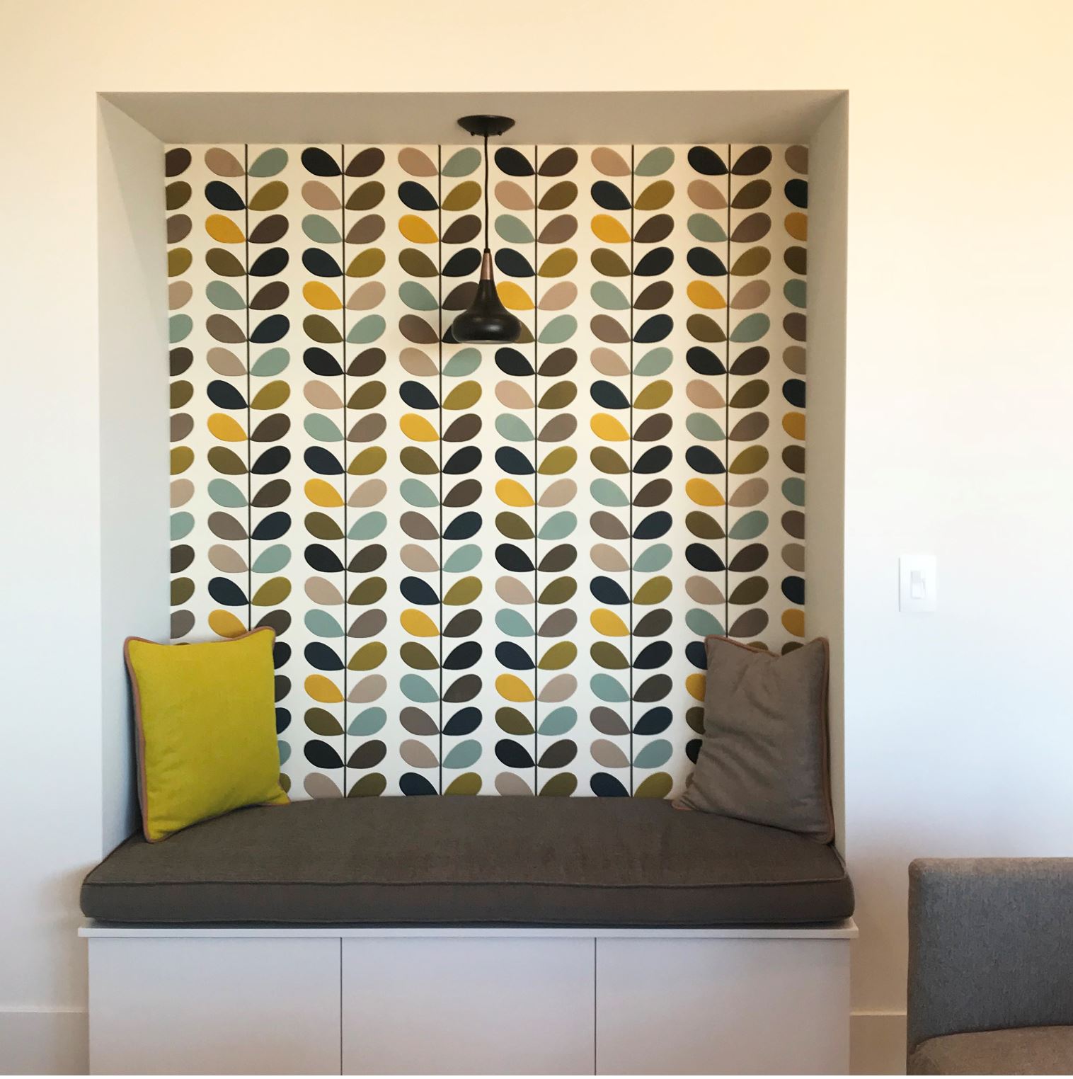
Nystrom Design presented several furniture diagrams to help the clients think through the possibilities. Ultimately, they decided to forgo the Murphy bed they originally thought they wanted. Instead, we came up with a solution to accommodate guests using a sunroom on the upper level. The niche that had been planned for the Murphy bed was turned into a cozy reading alcove with storage below the seat.
During the lull in the decision-making process, communication between the clients and the builder had become strained. But as we produced the deliverables that the builder needed, the project got back on track. With a clear and timely direction, Sunset Builders was able to implement the design with skill and efficiency.
We worked through a number of design decisions with the same methodical, collaborative approach. The primary goal was to facilitate the client’s decision-making process and provide the builder with a clear direction.
Our clients moved back into their home in April, and have plans to be there for many years to come. A worthy reason to celebrate!
Stay tuned for professional photography coming soon to our website!

share it
email it